What is Included in HTML Template
Included with this theme are the following:
- index.html - the main template file from where you can edit the website's content.
- assets/
- bootstrap/ - includes the Bootstrap dist files. It is NOT recommended to edit these files.
- css/ - includes the template styles and the font files.
It also includes custom css file which is intended to include your custom styles for your website.
- images/ - all the images used in the theme are found in this folder
- js/ - includes the JS scripts used in the template.
- php/ - includes mail.php file which is the mailer function of the template contact form.
HTML Structure
The main page (index.html) of this template is structured as follows:
<div id="outer-container">
<!-- LEFT SIDEBAR -->
<section id="left-sidebar">
<!-- logo -->
<div class="logo"></div>
<!-- main menu -->
<ul id="main-menu">
</ul>
</section>
<!-- MAIN CONTENT -->
<section id="main-content">
<!-- intro section -->
<article id="intro" class="section-wrapper"></article>
<!-- text section -->
<article id="text" class="section-wrapper"></article>
<!-- carousel section -->
<article id="carousel" class="section-wrapper"></article>
<!-- grid section -->
<article id="grid" class="section-wrapper"></article>
<!-- featured section -->
<article id="featured" class="section-wrapper"></article>
<!-- tabs section -->
<article id="tabs" class="section-wrapper"></article>
<!-- contact section -->
<article id="contact" class="section-wrapper"></article>
</section>
<!-- FOOTER -->
<section id="footer">
<!-- social icons -->
<ul class="social-icons">
</ul>
<!-- copyright text -->
<div class="footer-text-line"></div>
</section>
</div>
Main Menu
To edit the main menu, you have to look for the <ul id="main-menu">.
- Each menu item links to a section (see section Sections below) in the main content.
- Each menu item should follow this format:
<li id="menu-item-[link section unique id]" class="menu-item scroll">
<a href="#[link section unique id]">[Link text to the section]</a>
</li>
- If you want to include a link which doesn't scroll to a section inside the page, remove the "scroll" class from the
<li>, and include the external link in the <a href="[link]">
Sections
Each website section is contained in an <article class="section-wrapper"> tag inside the
<section id="main-content">.
- It is important that each section will have unique id.
- It is possible to set a custom background for each section by setting "data-custom-background-img" attribute for the
<article> tag. It should be URL linked to a background image. (More information about the website background(s) is found
in the section Page Background Images below)
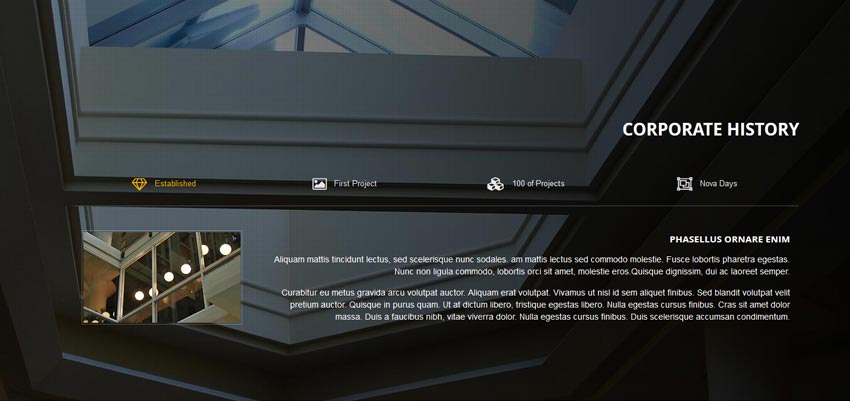
- The theme includes seven types of sections:
- Intro : includes a header with short paragraph of text and can include a button.
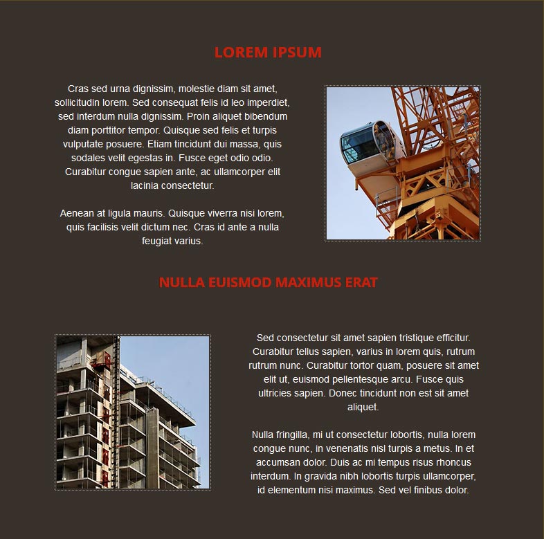
- Text - About Us : includes general content about your company (text, images, etc).
- Carousel - Models : includes slider, with each slide containing an icon or image, text and optional button.
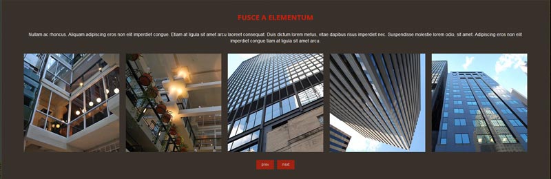
- Grid - Our Services : includes a grid with separate feature items each having an icon and a short sentence.
- Featured - includes a maximum of 3 features consisting of a thumbnail and a short sentence. Each item may be linked.
- Tabs - Our Achievements : includes a grid with separate tabs.
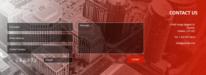
- Contact - includes a short paragraph and a contact form.
II IS IMPORTANT to change the email address at the top of the assets/php/mail.php file to the email address
that you want this form to send to.
You can edit, add, remove and/or duplicate these sections depends on your needs, as long as you give them each a unique id and do not
change HTML structure for each section:
<article id="[section id]" class="section-wrapper clearfix"
data-custom-background-img="[optional background image URL]">
<div class="content-wrapper clearfix"> [ content to edit ] </div>
</article>
Sections Animations
the template includes animation effects to create a smooth intro reveal effect when the user scrolls to each section,
the source code you can find in 'js/wow' folder.
As explained on the WOW website, you can add reveal animations to any html element:
- pick an animation style in animate.css
- add the CSS class to any HTML element
The template already comes with animations set for the intro section at <div class="content-wrapper clearfix wow fadeInDown">.
You can edit this or add other effects to any other HTML elements inside the page.
Background Images
The template is designed to have at least one high-resolution page background image, which stretches along the whole page.
To set the default page background image you have to insert the image URL in the template <body> tag as the following:
<body data-default-background-img="[background image URL]" data-overlay="true"
data-overlay-opacity="0.35">
Set "data-overlay" attribute to "false" to disable semi-transparent black overlay on top of the background.
Set the opacity/transparency of this overlay in the "data-overlay-opacity".
Custom page backgrounds for each section
The template allows you the possibility for the background image to change whenever a user scrolls to each section.
You can set a different background image for each section by including the image URL in the "data-custom-background-img" attribute for each
<article class="section-wrapper">.
If no background image is specified for a section, the default background image is shown by default.
Enable/Disable Background Change
The template is intended to show only one background image on mobile in order for the site to load faster and minimize the data being transferred.
Although not recommended, you can still enable the background changes on scroll, on mobile in /assets/js/initialise-functions.js file:
- To enable mobile background change: uncomment the following line at the top of initialise-functions.js:
background_settings.change_on_mobile = true;
- To disable background change on non-mobile (tablet, desktop): add the following line at the top of initialise-functions.js:
background_settings.change_on_nonmobile = false;
- To use a custom background (other than the provided script and methods): add the following line at the top of initialise-functions.js:
background_settings.use_script = false;
Content Popup Windows
The template allows to include more content in popup windows.
To add a new popup, create a <div class="content-to-populate-in-modal"> anywhere inside the page, give it a unique id and then insert content as below:
<div class="content-to-populate-in-modal" id="[unique id]">
[ content which will be included in the popup ] </div>
To link a button or link to the popup you have to add onClick event to the button as the following:
<a href="" onClick="populate_and_open_modal(event, '[unique id of popup content]',
'[optional ID of section within popup to link to]',
'[optional class to add to modal container]');"
class="btn btn-outline-inverse btn-sm">read more</a>
Initialising custom Javascript functions after popup is open or closed
To initialise a custom JS function after the popup is opened in the JS file /assets/js/initialise-functions.js,
add the following in the initialise_document_ready_functions():
$('#common-modal').on('shown.bs.modal', function()
{
// function to initialise when popup is open
});
If you want to initialise a custom JS function after the popup is closed:
In the JS file /assets/js/initialise-functions.js, add the following code in the initialise_document_ready_functions():
$("#common-modal").on('hide.bs.modal', function()
{
// function to initialise when popup is closed
});
Keep in mind the these two event handlers above apply EVERY TIME a popup is opened/closed.
If you want to apply a custom Javascript function to a SINGLE POPUP (instead of all):
- Wrap the particular popup's content inside a container with a unique ID:
<div class="content-to-populate-in-modal" ...... >
<div id="unique-id"> [POPUP Content] </div>
</div>
- Modify the function that was added above in initialise-functions.js, as below:
$('#common-modal').on('shown.bs.modal', function()
{
if ($('#common-modal #unique-id').length > 0)
{
// function to initialise when ONLY this popup is open
}
});
Carousel
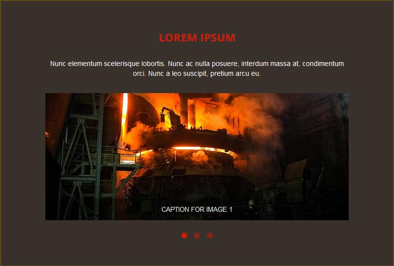
In one of the sections the template includes a Bootstrapped carousel (<article id="carousel">).
Each carousel within the page, should consist of the following (taking our example as guide):
-
The carousel must to be inside a container as below:
<div id="[unique id for each carousel]"
class="carousel slide with-title-indicators max-height"
data-height-percent="70" data-ride="carousel">
[...]
The unique id is important, and needs to be initialised in the JS file /assets/js/initialise-functions.js:
$('#[unique id for each carousel]').carousel({ [...] });
The "data-height-percent" attribute is optional, it is set the percentage height in proportion of the window height on large, non-mobile viewports.
-
At the bottom the carousel includes indicator slide titles as navigation.
These are found inside <ol class="carousel-indicators title-indicators">,
and should represent all the carousel slides.
It is important that the "data-target" attribute for each indicator is the unique id of the carousel.
-
Each carousel slide is found inside <div class="carousel-inner">, as follows:
<div class="carousel-inner">
<div class="item active">
<div class="carousel-text-content"> [ custom slide content ] </div>
</div>
</div>
-
The carousel includes navigation left/right arrows to move from one slide to another. These can be found at the bottom of the carousel container:
<a class="left carousel-control" href="#[unique id for each carousel]" data-slide="prev"></a>
<a class="right carousel-control" href="#[unique id for each carousel]" data-slide="next"></a>
It is important that the "href" attribute for each link is the unique id of the carousel.
Owl Images Carousel
The template has an option to include Owl Images Carousel,
the responsive carousel allows you to create elegant image sliders.
In his template the Owl Carousel is placed inside of a popup (see section Content Popups above),
and initialised when the popup is opened.
The content for the image carousel is placed inside the <div class="content-to-populate-in-modal"> as below:
<div class="content-to-populate-in-modal" id="[modal-id]">
<div id="unique-id-for-image-slider" class="owl-carousel popup-image-gallery">
<div>
<h6 class="caption">Caption for Image 1</h6>
<img class="lazyOwl" data-src="assets/images/backgrounds/bg1.jpg">
</div>
[...]
</div>
</div>
Each Owl Carousel inside of a popup and has a class of ".popup-image-gallery" is initialised in the
/js/initialise-functions.js when the popup is visible, using the Bootstrap "shown.bs.modal" carousel event handler:
$('#common-modal').on('shown.bs.modal', function()
{
[Owl Carousel parameters]
});
The Owl Carousel parameters can be modified how you want, more information can be found on the Owl Carousel website:
www.owlgraphic.com/owlcarousel
Since the carousel is located in a popup, an extra function in /js/initialise-functions.js destroys the carousel when the popup is closed
and re-initialised when popup is re-opened. This is done using the Bootstrap "hide.bs.modal" carousel event handler and the Owl Carousel
destroy() function:
$('#common-modal').on('hide.bs.modal', function()
{
[...]
});
Alternative Image Gallery Carousel
The template also includes an alternative image gallery carousel inside a popup.
Similar to the instructions mentioned above, the content for the alternative image carousel is placed inside the
<div class="content-to-populate-in-modal"> as below:
<div class="content-to-populate-in-modal" id="[modal-id]">
<div id="unique-id-for-alt-image-slider" class="owl-carousel popup-alt-image-gallery">
<div class="item">
<a href="[URL of image to open on click]" data-lightbox="popup-alt-gallery">
<img class="lazyOwl" data-src="[URL of image thumbnail]">
</a>
</div>
[...]
</div>
</div>
Each alternative image gallery, which is located inside of a popup and has a class: ".popup-alt-image-gallery", is initialised
in the /js/initialise-functions.js when the popup is visible, and it is using the Bootstrap "shown.bs.modal" carousel event handler.
Please note that you can still use Owl Carousel anywhere in the theme where you want, you just need to create a different carousel
with different parameters, use the same HTML described above but remove the class ".popup-image-gallery".
Then, intialise it in /js/initialise-function.js or at the footer of the page using the unique ID of that particular carousel instead of the class.
Tabs
The templae Bootstrap Tabs section (<article id="tabs">) is ideal for content which can be categorised in multiple sections.
More information about Bootstrap Tabs can be found on Bootstrap's documentation page.
Tab Icons
The tabs can include Glyphicon or Font Awesome icons. Each tab's icon and text are structured as follows:
<li role="presentation">
<a href="#tabs-tab3" aria-controls="tabs-tab3" role="tab" data-toggle="tab">
<i class="icon fa fa-coffee"></i><span>Iaculis</span>
</a>
</li>
Icons are included in
<i> and text in
<span>. Either of them can be removed.
To hide text and show icons only on different viewports, for example on mobile devices only, you assign the following attributes to the
<ul class="nav nav-tabs" text-hidden-xs="true"..>
- text-hidden-xs="true": On extra small devices (mobile), text is hidden and only icons are displayed.
- text-hidden-sm="true": On small devices (tablets), text is hidden and only icons are displayed.
- text-hidden-md="true": On medium and large devices (desktops), text is hidden and only icons are displayed.
- If either is set to false, both icons or text are shown.
For more information about which icons to use, see section Scalable Font Icons below.
Initializing custom Javascript functions after tab is shown/hidden
In case you want to initialise a custom JS function when a tab is shown or hidden, you can use event handlers as described in
Bootstrap's documentation.
For example, to initialse a function after a tab pane is shown, in the JS file /assets/js/initialise-functions.js, add the following
in the initialise_document_ready_functions():
$('a[data-toggle="tab"]').on('shown.bs.tab', function (e)
{
// function to initialise when tab is shown
});
Contact Us Form
When installing this theme, it is very important to change the 2 email addresses at the top of the assets/php/mail.php file:
- $email_to - the email address that you want this form to send to.
- $email_from - the "From:" email address with which form submissions are sent, important that it has the same domain
as the domain of your site - unless you have configured your server's mail settings.
The form includes the following fields:
- Full Name - required
- Email Address - required
- Contact Number
- Message - required
The form also includes a CAPTCHA, intended to filter spam.
The captcha only works if a PHP server is set (locally you need to use a tool like XAMPP, WAMP, or MAMP).
Scalable Font Icons
The templae has an option of using two scalable font icon sets:
Glyphicons
To add a Glyphicons icon, use the following code:
<span class="glyphicon glyphicon-[icon id]"></span>, OR:
<i class="glyphicon glyphicon-[icon id]"></i>
The full list of all available icons and their IDs can be found on:
getbootstrap.com/components websie.
Font Awesome
To add a Font Awesome icon, use the following code:
<span class="fa fa-[icon id]"></span>, OR:
<i class="fa fa-[icon id]"></i>
The full list of all available icons and their IDs can be found on:
fortawesome.github.io/Font-Awesome/icons/ websie.
Remember that these icons should be treated as a "text" rather than an "image icon". This means that if, for example, you want to change their colour,
you should use the CSS "color" rule, as you do to any text, or if you want to increase their size, you have to alter their "font-size" value... and so on.
Social Icons
To edit the social icons list, you have to look for the <ul class="social-icons">.
- Each social icon item should follow this format:
<li>
<a href="[social page link URL]" target="_blank" title="[social website]">
<img src="assets/images/social/[social website].png" alt="[social website]">
</a>
</li>
-
All social icon images can be found in the directory /assets/images/social/
Sources and Credits


On the live server the Captcha is working. I don't know why. ...